Archives

Tagged ‘Colour Consultant‘
The Importance of Getting the Joinery Colours Right

The Importance of Getting the Joinery Colours Right

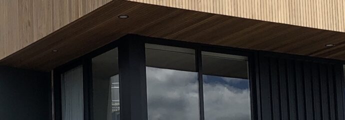
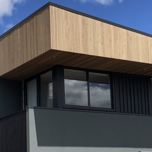
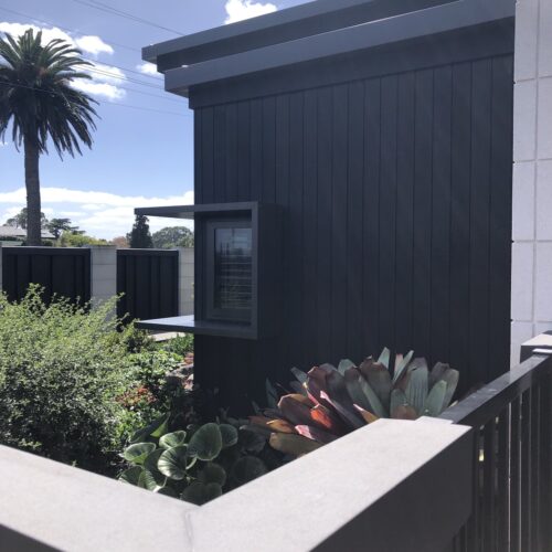
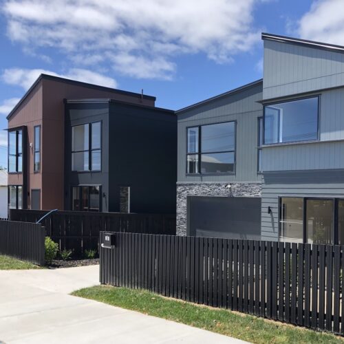
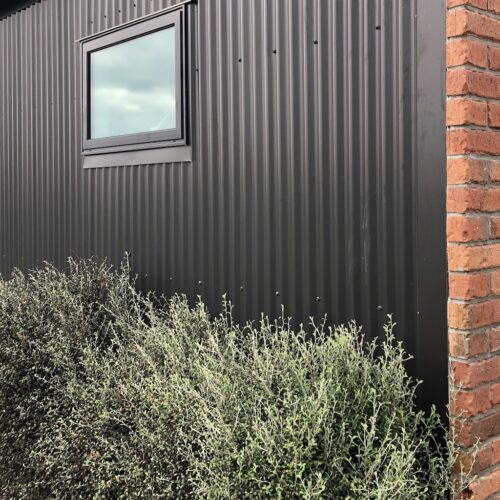
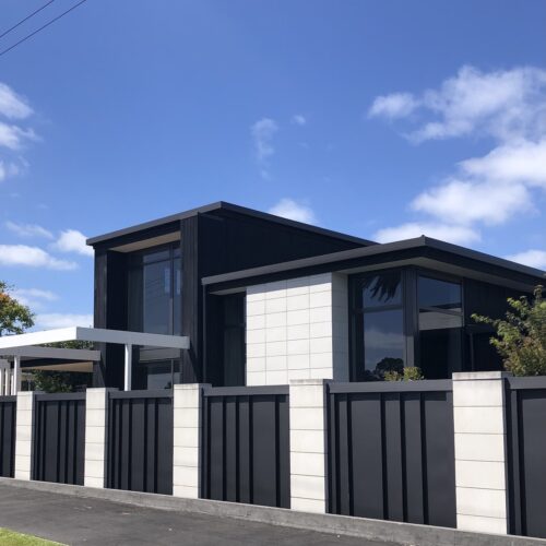
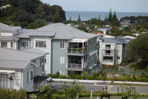
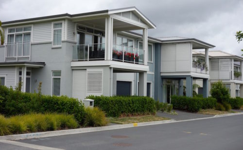
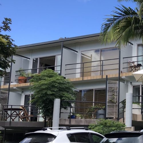
The joinery colour has a huge influence on the dynamics of your home.  The colour must be considered for both the interior and exterior aesthetics. Usually it is ordered (along with the roof) earlier in the build, so the colour decision should be made early.  I tend not to use ‘Ebony’ , as I think we have less harsh options such as ‘Flaxpod’ which reads black, but is softer/warmer.  ‘Windsor Grey’, ‘Charcoal’ or ‘Gravel’ also read as black from a distance.  They are more a charcoal, and work well with the green and blue tones. (As in the above photo).   ‘Electric Cow’ and ‘Ironsand’ are also great options where there is timber, and the warmer options work well.  There are many more options, including anodised from various suppliers to choose from.  Consideration must be given to the roof and guttering colours at this stage too.  There are no rules, and there are always exceptions, but a sense of how the colours ‘behave’ on the building, and the colours adjacent to them are crucial to the overall look. What they bring are proportion, enhancement of features, and the general sense of style. The location also has a huge influence on the colours.

When looking at the lighter colours like Duralloy’s newer ‘Okarito’ and ‘Snowstone’, or ‘Appliance White’; ‘Warm White’ or ‘Titania’, it is the time to be deciding on your interior colours – from your architrave colour to your bench top and even carpet, tiles etc.  I would avoid the stark blue white of  ‘Arctic White’ unless you are working with the icy blues.   There are many other choices in the mid tones as well.

Ideally most of the interior and exterior design is done prior to ordering the joinery and roof.  Of course there will be some adjustments along the way, but you won’t be locked into a colour choice you are not happy with, that influences the rest of the design, because you had to make the joinery colour choice in a hurry.

If you are having steel joinery …. it is black all the way!!

Exterior Colour Scheme

Interior Designer – Fiona Small

Commercial Exterior Colour Schemes, and Why It is Important to Use the Paint Brand Specified.

Commercial Exterior Colour Schemes, and Why It is Important to Use the Paint Brand Specified.

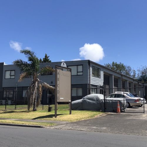
Exterior colour schemes for houses; apartments and commercial buildings are a specialty at Sienna Design.  You are still buying the paint, so let’s get the colours right.  Having the confidence of choosing which colour combination works best for your building comes from years of working in this industry.  It is essential you use the paint brand specified, as each paint company has its own unique base and pigment colours, and this reflects in the final complexity of colour. This is particularly important with exterior colours, as outdoor light changes throughout the day and season, impacting on which colours show more predominantly at the time.  I would advise you make this clear with your painters before they begin painting.

Colour Consultant – Fiona Small

Apartments

Interior Designer – Fiona Small
 

Next Level Greens

Next Level Greens

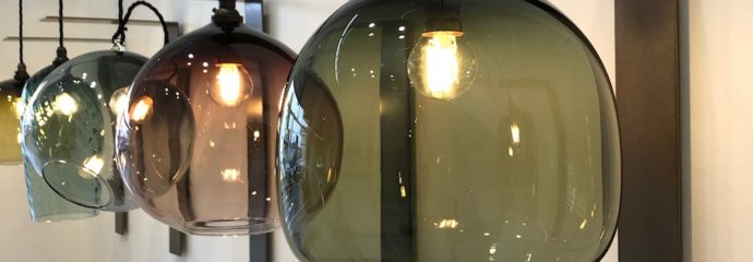
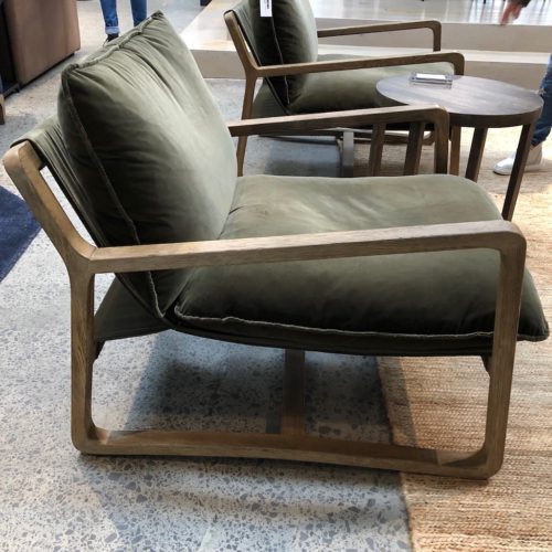
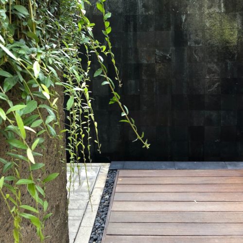
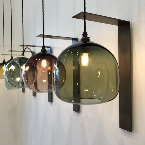
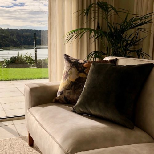
Drawn to the colour and form of Dawson’s Ace Chair in olive green velvet, Monmouth’s Dome Pendant lights, along with Weave’s Ava Jade and Impasto cushions, as they bring the calm of nature inside.


Dawsons chair

Monmouth lights


Horner’s Confectionery – Dulux Cook Strait & Huka Falls

Horner’s Confectionery – Dulux Cook Strait & Huka Falls

This was an enjoyable project to work on last year, particularly as the owners had some vision, and were not afraid of some colour…. the right colour of course.  As it is a well known sweet company, I didn’t think the predictable sweet colours were right. The Charcoal joinery framed the Dulux colours of Cook Strait and Huka Falls with the doors in Dulux Torrent Bay, and Dulux Whangaroa keeping the vibe fresh and lively.


Exterior Colour Consultant – Residential Development – Kensington Park Orewa Update

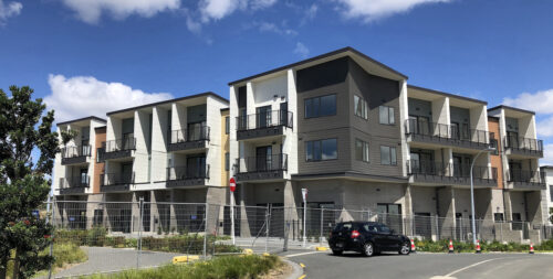
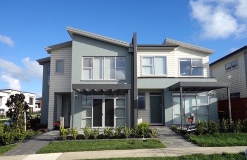
I have been working on the Kensington Park exterior colour schemes for the last 4 years.  There are still some buildings to be built and painted, but I was out there last week, and so pleased with the overall look.  As you can imagine the process of creating the exterior colours for an expansive hillside, which is viewed from all around Orewa, needs careful consideration for the owners of the houses looking down onto the roofs, as well as the people living at Kensington Park, and the enhancement of the cityscape.  Colour balance, flow, harmony as well as practical elements such as the LRV rating allowed on weatherboards, come into the process when I am choosing the range of colours.  Being an artist certainly helps when working on the overall concept, and being able to visualise how it will look.  The landscaping has been well thought through to enhance the space and its buildings.  Here are a few more photos of the latest stage to be completed.

DSC00454.JPGDSC00421.JPGDSC00425.JPGDSC00437.JPGDSC00461.JPG

Commercial Exterior Before & After

Exterior makeover and ready to be leased.

Before

IMG_1646.JPG

After

IMG_2364.JPG

Interior Designer – Flatbush Residential Development – Auckland


IMG_1233.JPG

IMG_1234.JPG

IMG_1236.JPG